Patient Charting Experience 🩺
The NextGen Mobile chart redesign focused on transforming how healthcare providers document patient visits. Traditional documentation methods are time-consuming and prone to errors, detracting from patient interactions.
Summary
This case study highlights my process for leading a complex design effort from research and ideation to testing and delivery.
- An AI-powered ambient assist tool that seamlessly integrates into providers’ workflows.
- A modular charting experience for SOAP notes, diagnosis, medications, orders, and charges.
Results
The project delivered measurable results:
- 25% reduction in documentation time.
- 300% growth in premium user accounts within one year.
- 20% increase in app usage six months post-launch.
Tools
The tools used throughout this study includes:
- Design & Prototyping: Figma, Adobe XD
- Research: User Testing, Lyssna
- Collaboration: Jira, Teams, Confluence

The Challenge 🧦
The core challenge was like trying to sort laundry in the dark—except the socks are CPT codes, the shirts are ICD-10s, and everything smells vaguely of stress and coffee.
The Problem
Over 80,000 users of NextGen’s system face:
- Fragmented workflows that required switching between multiple tools.
- High cognitive load caused by repetitive tasks like manual data entry.
- Limited mobile functionality leaving providers tethered to desktop systems.
Goals
Through research, I discovered that saving time for providers is their primary goal. By reducing their documentation burden, we could give them back valuable time—time to spend with their families and regain a healthier work-life balance. Too often, providers are stuck charting on weekends, dedicating far more time to documentation than delivering value to patients.
To address these pain points, I established the following objectives:
- Streamline the charting process by leveraging AI to automate repetitive tasks.
- Design a cohesive mobile-first experience that allows users to manage all key functions within one app.
- Reduce provider burden by simplifying SOAP notes, diagnosis, orders, medications, and charges.
Project Constraints
Barriers we faced:
- Cross-functional alignment: Balancing the needs of product managers, engineers, and providers requires careful coordination.
- AI integration challenges: Ensuring AI was accurate and contextually relevant in a highly regulated healthcare environment.
My Role 🧻
Just roll with it 😜…
As the lead product designer for the Ambient AI workflow integration, I designed and implemented modules for diagnosis, medications, orders, and charges, creating a seamless charting experience.
Leadership
As the Lead Product Designer, I oversaw the entire design process:
- Directed a team of three designers and researchers, mentoring them through low-fidelity explorations and high-fidelity execution.
- Collaborated with engineering, product, and stakeholders to ensure alignment.
User Research
- Conducted contextual inquiries and usability studies with over 50 healthcare providers to gather insights and validate designs.
- Completed onsite visit with a doctor and his practice to see our tools in action.

Design Execution
As a design team we:
- Created wireframes and low-fidelity prototypes.
- Designed complex, high-fidelity prototypes for AI-driven interactions and smart data entry.
- Developed a modular design system along the way, ensuring consistency across all charting modules.
Process 🛠️
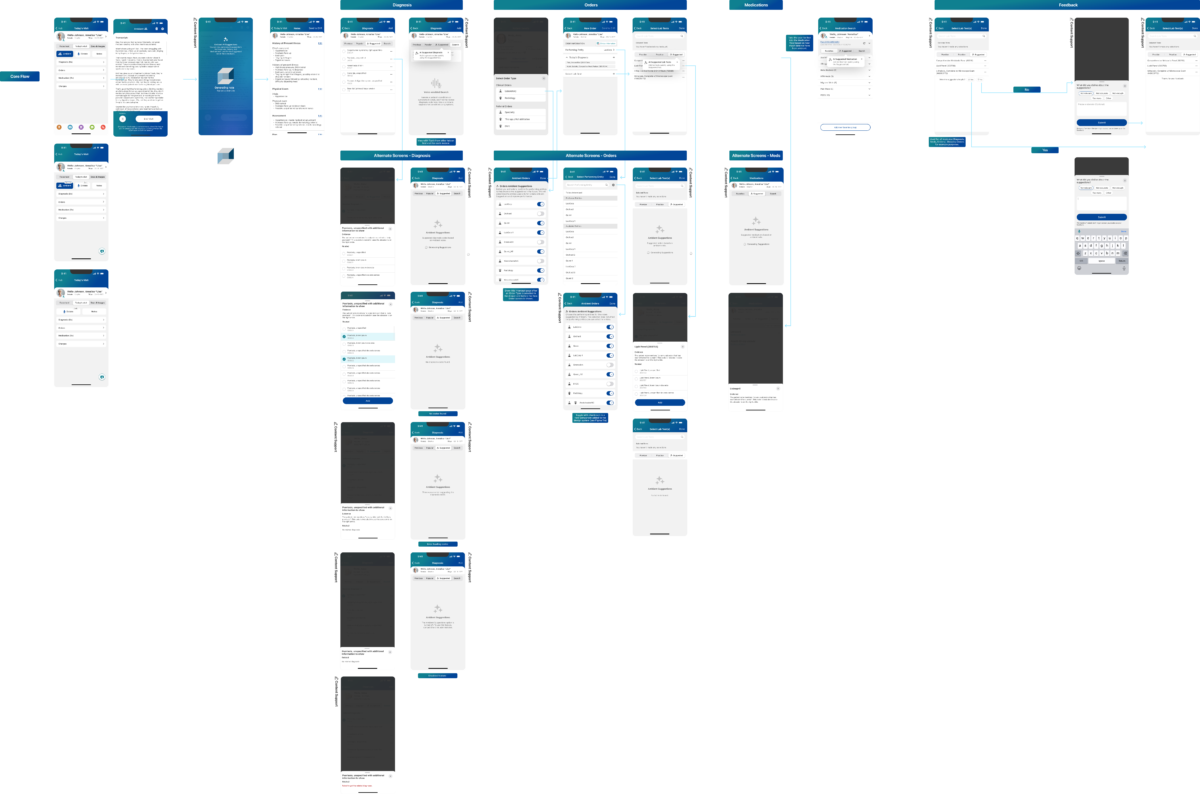
I led user research to deeply understand provider workflows, created low-fidelity concepts to establish the design vision, and collaborated with my team to transition to high-fidelity prototypes.
Research and Discovery
I began by interviewing providers in various specialties, observing their daily workflows, and identifying key pain points:
- Time inefficiency: Providers spend up to 30% of their time on documentation, sometimes even more.
- Lack of intelligent features: Many manual tasks could have been automated.
- Poor mobile usability: Existing tools needed more functionality for on-the-go use.
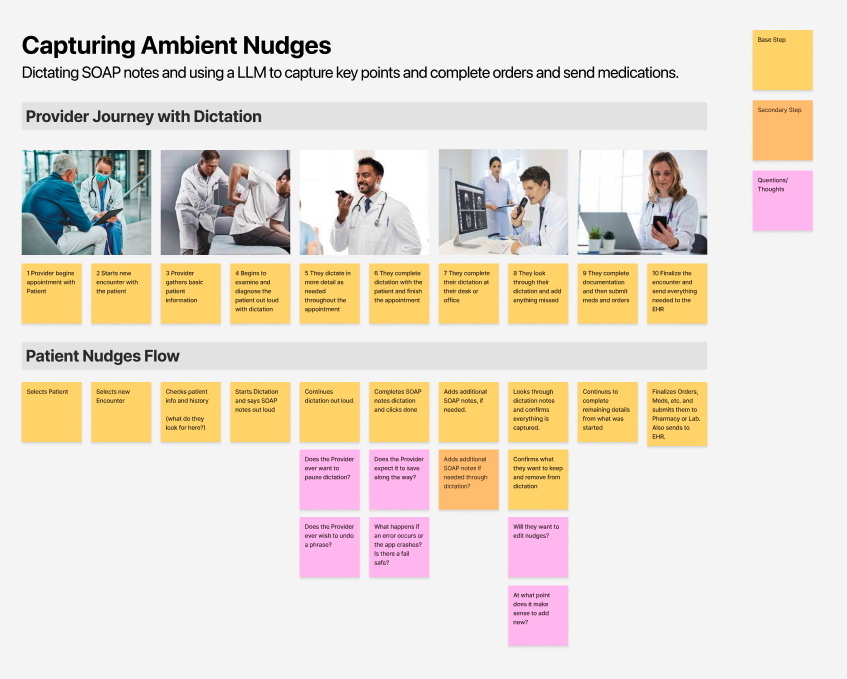
I created user personas and journey maps from these insights to guide our design decisions.


Defining the Vision
Building on the research, I set clear design principles:
- AI-Driven Efficiency: Automate repetitive tasks with intelligent suggestions.
- Intuitive Navigation: Simplify workflows for SOAP notes, diagnosis, orders, medications, and charges.
- Scalability: Ensure the design system can adapt to future features and enhancements.
I collaborated with stakeholders to define KPIs, including documentation time reduction and user adoption rates.
Designing the Solution
The ambient assist tool was the centerpiece of our redesign. Key features included:
- AI-Powered Dictation: Providers could dictate SOAP notes, and the tool auto-generated structured content.
- Smart Suggestions: Real-time recommendations for diagnoses, medications, and orders based on patient data.
- Context-Aware Validation: Alerts for potential errors or omissions.
Comprehensive charting modules were a must and included:
- SOAP Notes: Pre-populated fields with AI-suggested content that providers could edit.
- Diagnosis: Streamlined search with predictive ICD-10 coding.
- Orders and Medications: Quick reordering from patient history with suggested dosages.
- Charges: Simplified entry, integrating seamlessly with billing systems.
I led the creation of a modular design system, which included:
- Reusable components for rapid iteration.
- Visual consistency across modules.
- Accessibility features for compliance with healthcare standards.

Workflow 1
Picking Up the Pieces 🏚️
I led the design of an AI-powered Ambient Assist tool for an industry’s first-ever ambient AI flow, seamlessly integrating diagnosis and CPT codes derived from ambient conversations.
Integrating AI Naturally into Workflows
Rather than forcing AI into existing processes, my goal was to ensure it became a natural part of the workflow. While the business sought to add AI capabilities, I focused on enhancing the experience so it felt integral—like the workflow couldn’t exist without it.
A Groundbreaking Partnership with Amazon AWS LLM
As the first health group to integrate AWS’s health-focused LLM, we collaborated to incorporate medical suggestions for diagnosis codes, medications, and CPT codes directly into the provider workflow.
Empowering Doctors with Choice
Designing this flow required a careful balance: empowering doctors to make decisions without imposing AI-driven outcomes. We accounted for legal requirements and mitigated risks of AI hallucinations by ensuring AI outputs were advisory, not prescriptive.
Transforming Notes into Timely Suggestions
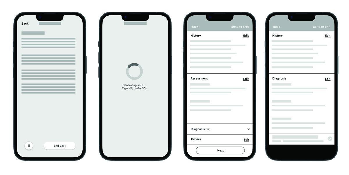
Initially, the product team proposed placing AI outputs as “nudges” in the early stages of the workflow. I reimagined this approach, shifting the concept to “suggestions” delivered precisely when and where providers needed them most—within each specific module (e.g., diagnosis, medications, charges).
This adjustment addressed key challenges:
- Asynchronous AI Calls: AI results could take over 30 seconds to load. To avoid delays, I designed the system to asynchronously load suggestions in the background while providers completed their notes.
- Improved Workflow Efficiency: Suggestions appeared contextually and at the right moment, enhancing usability and minimizing disruptions.
This approach not only improved provider efficiency but also set a new standard for integrating AI into healthcare workflows.
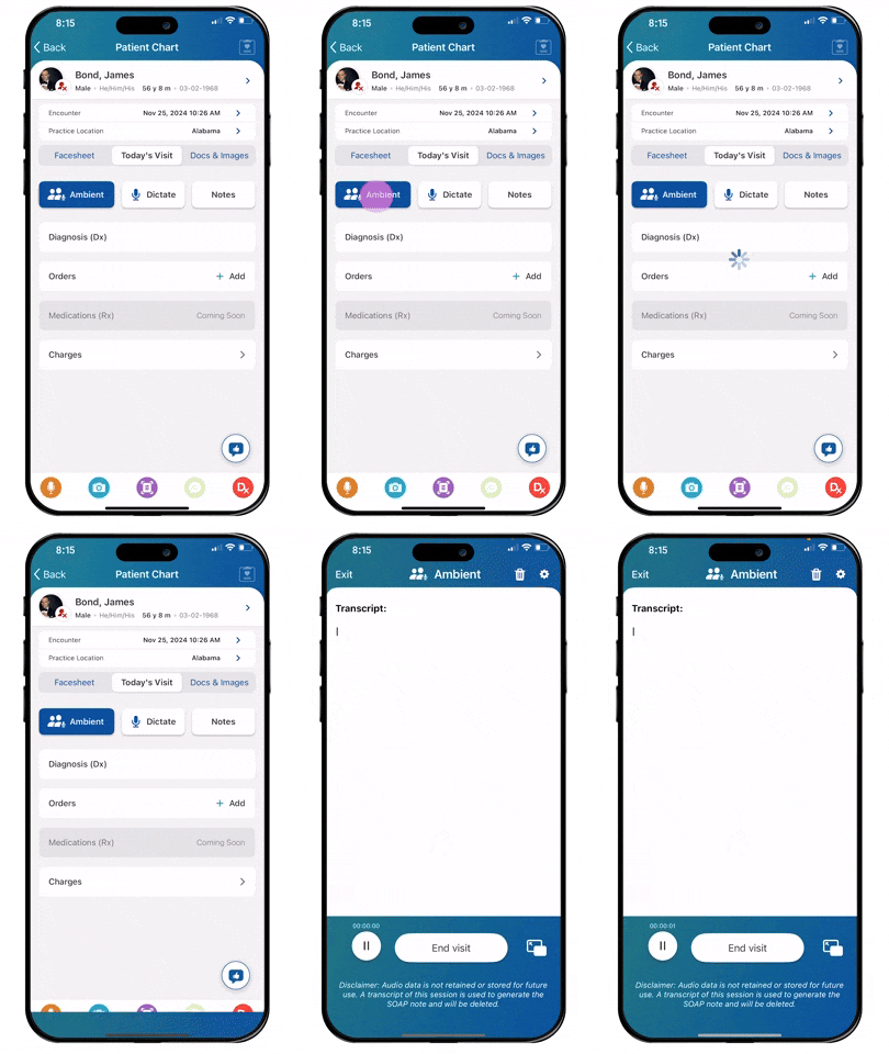
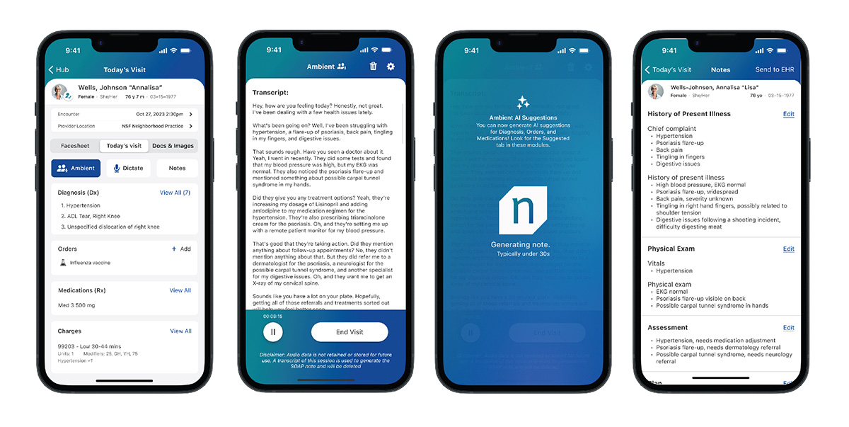
Starting an Ambient Assist Session
Providers can navigate the patient chart to dictate, select diagnoses, submit medications, orders, and charges effortlessly. It demonstrates a user-centered design approach, emphasizing simplicity and clarity to reduce cognitive load. As part of my case study, this step illustrates how the interface integrates essential features to streamline provider workflows and enhance documentation efficiency.
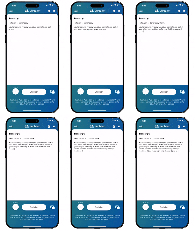
Seamless AI-Powered Dictation
Providers can dictate their notes directly into the app. The transcript is generated in real-time, offering a clear and editable summary of the interaction. This step highlights how the design integrates AI-driven features to streamline documentation, reduce provider workload, and maintain focus on patient care.
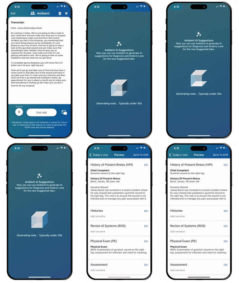
Effortless Transition to Notes with Fast Load Times
Transition from spoken dictation into an organized transcript, ready for SOAP note generation. The design emphasizes speed and efficiency, with near-instantaneous processing to keep providers focused on patient care without disruption. This step highlights the tool’s ability to streamline workflows through fast, reliable transitions.
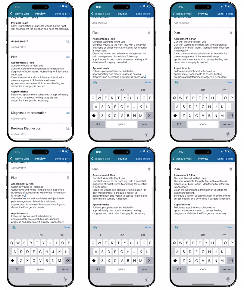
The tool automatically generates structured notes for a patient visit, dividing information into sections like “Physical Exam,” “Assessment,” and “Plan.” Providers can easily review, edit, and refine the narrative directly within the app, ensuring accuracy and customization.
Workflow 2
Diagnosis 🔍
The diagnosis module was the first module I tackled, serving as the proving ground for a new design system. While AI features weren’t included yet, I designed the module with future features in mind, ensuring it was adaptable.
Streamlining Diagnosis Selection
Our design focused on improving the process of selecting multiple diagnosis codes for each visit. To achieve this, we created three distinct views:
- Previous Diagnoses: Displayed past diagnoses relevant to the patient, reducing redundant data entry.
- Popular Diagnoses: Highlighted common options to save time and reduce cognitive load.
- Search View: Allowed providers to quickly search and add codes, setting the stage for future AI-assisted features.
Enabling Prioritization for Billing Accuracy
Recognizing the importance of billing and payment, we introduced functionality to help doctors sort and prioritize diagnosis codes. This ensured the primary diagnosis was always clear and accurate, streamlining downstream processes and minimizing billing errors.
Designing for the Bigger Picture
Although the diagnosis module was just one part of the workflow, it set the tone for the rest of the system. We created a foundation that aligned with our long-term vision by establishing reusable components and patterns. This not only improved the efficiency of the diagnosis process but also laid the groundwork for consistent, scalable design across other modules.
Impact and Evolution
The diagnosis module not only improved usability and accuracy but also demonstrated the value of designing with adaptability in mind. It provided a solid foundation for future innovations while immediately enhancing the provider experience.
Selecting Diagnosis Codes
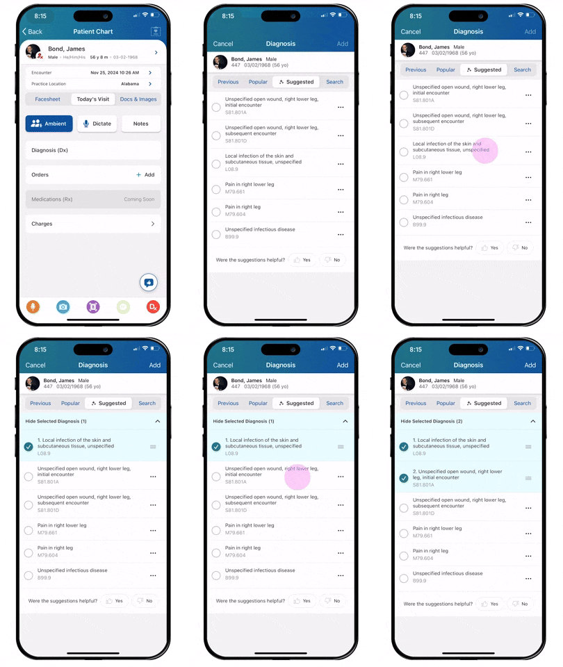
Providers can quickly navigate to the “Diagnosis” section and easily add or update diagnoses. The interface ensures seamless entry of details while integrating with other key functions such as orders, medications, and charges. This focused and intuitive module helps providers maintain accurate and up-to-date records, reducing administrative burden and improving the documentation workflow.
AI-Powered Diagnosis Search for Relevant Results
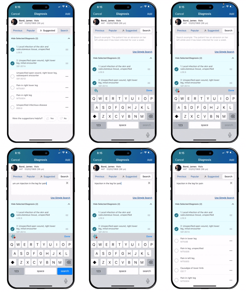
By leveraging AI, the app provides smart suggestions for diagnoses based on the patient’s clinical context. The interface categorizes results into tabs like “Previous,” “Popular,” and “Suggested,” ensuring quick access to relevant options. Users can easily select from the suggested diagnoses or refine their search further to find the most accurate match. This intelligent search enhances efficiency by reducing time spent on manual entry, improving accuracy, and supporting better clinical decision-making.
Workflow 3
Medications 💊
The medications module posed unique challenges due to the highly regulated nature of prescriptions. SIGs (specific instructions for medications) had to meet exact standards for alignment with pharmacies while maintaining consistency. This required a design that was both precise and adaptable, ensuring compliance without sacrificing usability.
Iterating on Workflow Structure
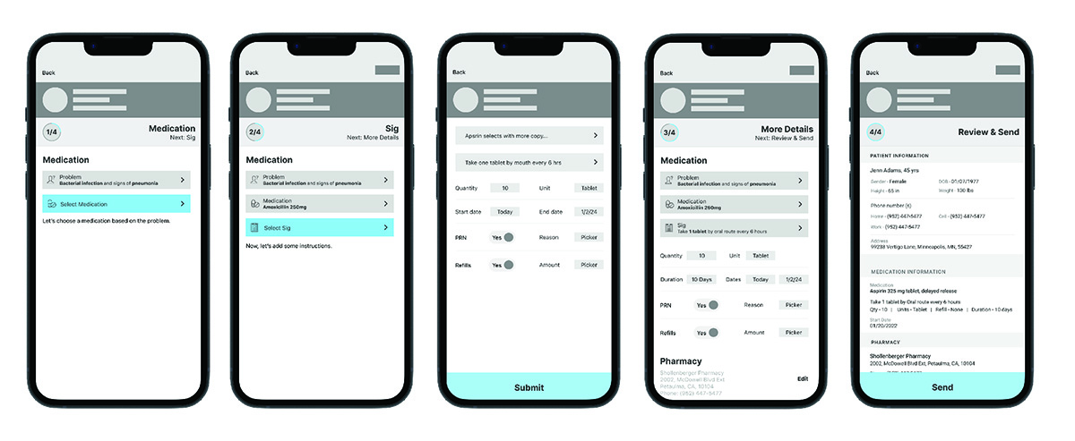
Initially, we explored a wizard-like, step-by-step flow to guide providers through the process. However, user research revealed that this rigid, linear approach slowed providers down. Time reduction being the primary goal, we pivoted to a more flexible design that broke the module into discrete steps. This allowed providers to:
- Skip unnecessary steps when time is critical.
- Dive deeper into building detailed SIGs when needed.
Personalization for Efficiency
To further enhance usability, the module introduced features for personalization:
- Providers could save medications as favorites for quick reuse.
- Custom SIGs enabled them to build on previous work, reducing repetitive tasks and ensuring consistent instructions for recurring prescriptions.
Striking a Balance Between Speed and Detail
The redesigned module offered a natural flow that adjusted to the provider’s needs. It balanced the need for quick actions with the option to add detailed instructions, empowering providers to work efficiently while maintaining accuracy.
Results Driven by User-Centered Design
By addressing the dual goals of regulatory compliance and time efficiency, the medications module achieved:
- Reduced time spent on prescribing workflows.
- Improved provider satisfaction through a streamlined, customizable experience.
This module demonstrated how thoughtful design could tackle even the most complex, regulated tasks, providing a scalable solution tailored to the demands of healthcare providers.
Flexibility Over Step-by-Step Guidance
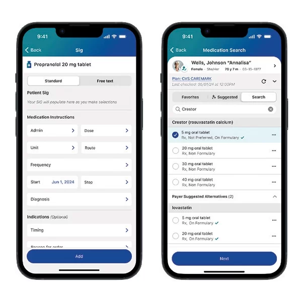
Initially, we considered using a step-by-step wizard approach for prescribing medications, but after further user research, we pivoted to a more modular design. This approach allows providers to select and navigate through the medication workflow in a way that suits their needs. By offering greater flexibility, the design empowers providers to customize their experience, streamlining medication management and enhancing usability without restricting their workflow.
Workflow 4
Charges 💰
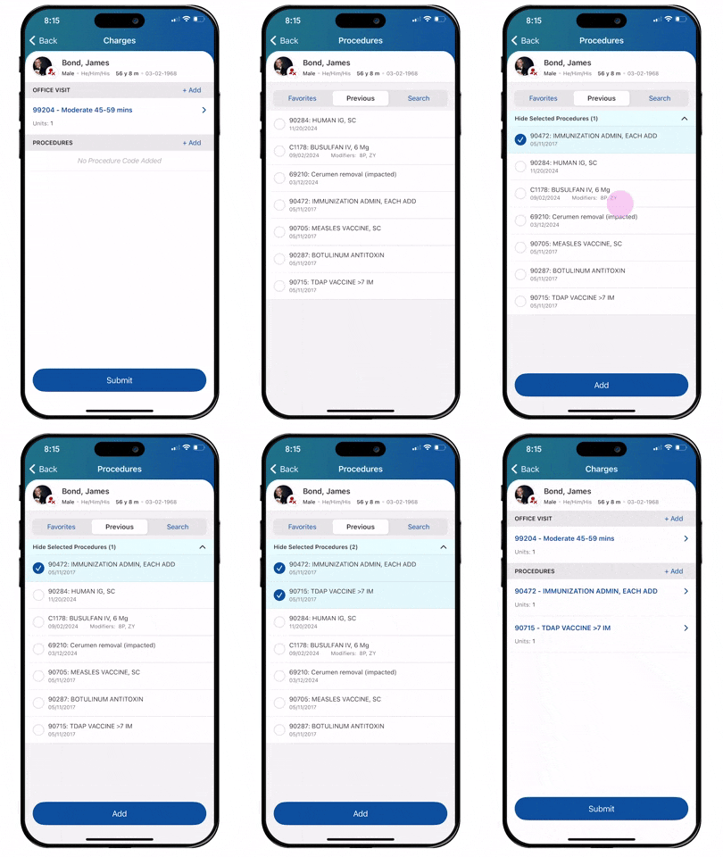
The charges module presented a unique challenge: integrating two distinct billing workflows—office visit codes and CPT codes—into a single, cohesive module. Office visit codes are typically limited to one per visit, while CPT codes can include several for different procedures. After multiple iterations and conceptual exploration, we developed a view that seamlessly accommodates both, allowing providers to add codes as needed without confusion or disruption.
Leveraging an Established Design System
By the time we reached the charges module, our design system and core workflows were well-established. This foundation allowed us to focus more intently on solving the specific challenges of consolidating these billing workflows rather than rethinking broader design patterns.
Enhancing Search for Billing Accuracy
A key aspect of the charges module was improving the search experience for CPT codes. We started with an OpenSearch approach, which provided a functional baseline. However, it became clear that we needed to enhance the experience further with AI-driven suggestions. I led the effort from a product perspective and encouraged the development team to explore more options. While exploring Gemini, we determined results weren’t relevant enough and instead implemented OpenAI, which allowed us to deliver expected results efficiently and at scale.
The final design offered:
- AI Suggestions for CPT Codes: Leveraging ambient data to propose relevant codes during the search process.
- Enhanced Search Tools: Helping providers quickly locate the correct CPT codes for accurate billing while minimizing manual input.
Introducing Favorite Groups for Efficiency
To streamline repetitive tasks, we introduced favorite groups. This feature allowed providers to:
- Save and organize sets of commonly used codes.
- Customize individual codes within groups using modifiers, ensuring flexibility while maintaining consistency.
Balancing Complexity with Usability
The final design struck a balance between accommodating the inherent complexity of billing and delivering an intuitive, user-friendly experience. Providers could efficiently manage office visit and CPT codes in one place while tailoring their workflows to meet their specific needs.
Results Focused on Provider Productivity
By consolidating workflows, enhancing search capabilities, and introducing personalization features, the charges module:
- Reduced time spent navigating and entering billing codes.
- Enhanced provider satisfaction by addressing the core challenges of complex billing processes.
The improved search functionality and AI-powered suggestions exemplified how thoughtful innovation could turn a complex workflow into an efficient and accurate solution.

Selecting an Office Visit Code
Simplifying the process of adding charges by starting with the selection of an office visit code. The design ensures that providers can quickly identify and select the appropriate code, reducing administrative burden and minimizing errors. By prioritizing clarity and efficiency, this workflow supports accurate billing while seamlessly integrating into the broader patient charting experience.
Efficient CPT Code Selection for Procedures
Selecting CPT procedure codes within the charges workflow. Designed for speed and accuracy, the interface allows providers to quickly locate and apply the correct codes for procedures. This ensures precise billing and enhances the overall efficiency of the charting and reimbursement process.
Adding Modifiers and Selecting Diagnosis Codes for CPT Procedures
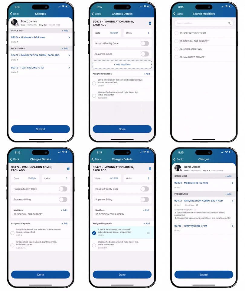
Enhancing CPT procedure codes by adding modifiers and selecting corresponding diagnosis codes. The intuitive interface allows providers to easily adjust settings, ensuring that each procedure is accurately linked to the right diagnosis for proper billing and reimbursement. By streamlining this step, the design helps reduce errors and administrative time, improving both clinical workflow and billing efficiency.
Testing and Iteration 🧪
I led rigorous usability testing with healthcare providers, using high-fidelity prototypes to validate complex AI-driven interactions like smart dictation and data entry. Feedback from these sessions guided iterative refinements, ensuring the solution aligned with real-world workflows and enhanced usability.
Checking Usability
We conducted usability experiments with prototypes in staged clinical scenarios. Key iterations included:
- Simplifying AI Interactions: Initial designs overwhelmed users with options, so we streamlined suggestions.
- Improving Visual Hierarchy: Enhanced focus on high-priority actions to reduce cognitive load.
- Balancing Automation: Ensured AI features complemented, rather than replaced, provider input.
Onsite Visit
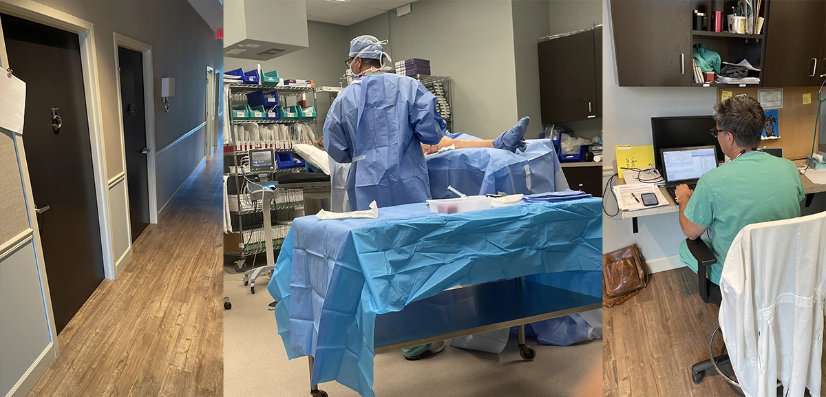
During my onsite visit to Savannah, Georgia, I conducted in-depth user research with healthcare providers to observe their workflows firsthand and gather critical feedback on the AI-powered charting tool. These insights directly influenced the design, ensuring it met real-world needs and seamlessly integrated into their daily routines. The research took place in both a small local practice setting where the providers met with patients and conducted small out-patient surgeries.
Outcome 📈
The Ambient Assist tool transformed provider workflows by delivering a more efficient, user-friendly charting experience, driving increased adoption and streamlining documentation processes.
Quantitative Impact
25% faster documentation
Providers saved 1-2 hours of charting every day.
300% increase in pro users
Adoption rates tripled within the first year.
20% growth in app usage
Monthly active users surged significantly post-launch.
Qualitative Feedback
Providers reported feeling “empowered” by the AI features, which they described as “intuitive” and “time-saving.”
Stakeholders praised the app for setting a “new benchmark in mobile healthcare tools for reducing documentation time.”
Reflection 🪞
This project showcased the power of collaboration, user-centered design, and iterative testing in tackling complex workflows. It reinforced the importance of aligning AI solutions with real-world needs to create impactful and meaningful user experiences.
The Good In It All
This project was a milestone in my career, highlighting the importance of:
- User-Centered Design: Grounding decisions in real-world provider needs was critical.
- Collaboration: Close partnerships with engineers, product teams, and end-users ensured a successful rollout.
- AI Usability: Designing intuitive interactions for complex AI systems requires constant iteration and testing.
If given the chance to revisit this project, I’d explore expanding the ambient assist tool’s functionality to include chronic problem-based charting analyzing patients over time, empowering providers with even more actionable insights.
Next Steps ⏭️
By establishing a strong design foundation and building a cohesive vision for the future of patient charting, I led my team to deliver a product that is not only innovative but also impactful in everyday clinical practice. Our efforts were instrumental in significantly boosting user engagement and satisfaction, paving the way for continued success and growth.
Next steps include refining each area of the charting experience based on ongoing feedback and insights. We will also focus on implementing a new “Super Favorites” feature, allowing users to create customized groups of frequently used orders and charting elements, further enhancing efficiency and personalization in their workflows. There is also a goal to incorporate an additional view using the problem-based charting method.
Want to learn more about my proprietary AI design process?
Let's have a conversation.
