Mobile App Portal
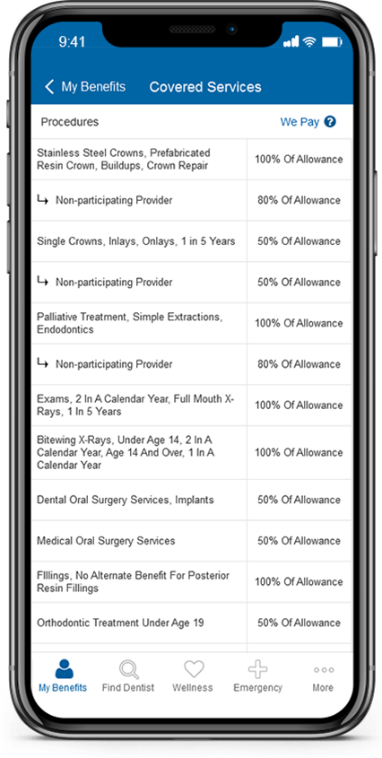
Redesign an outdated mobile app and make accessible member benefits, claims, and ID cards.
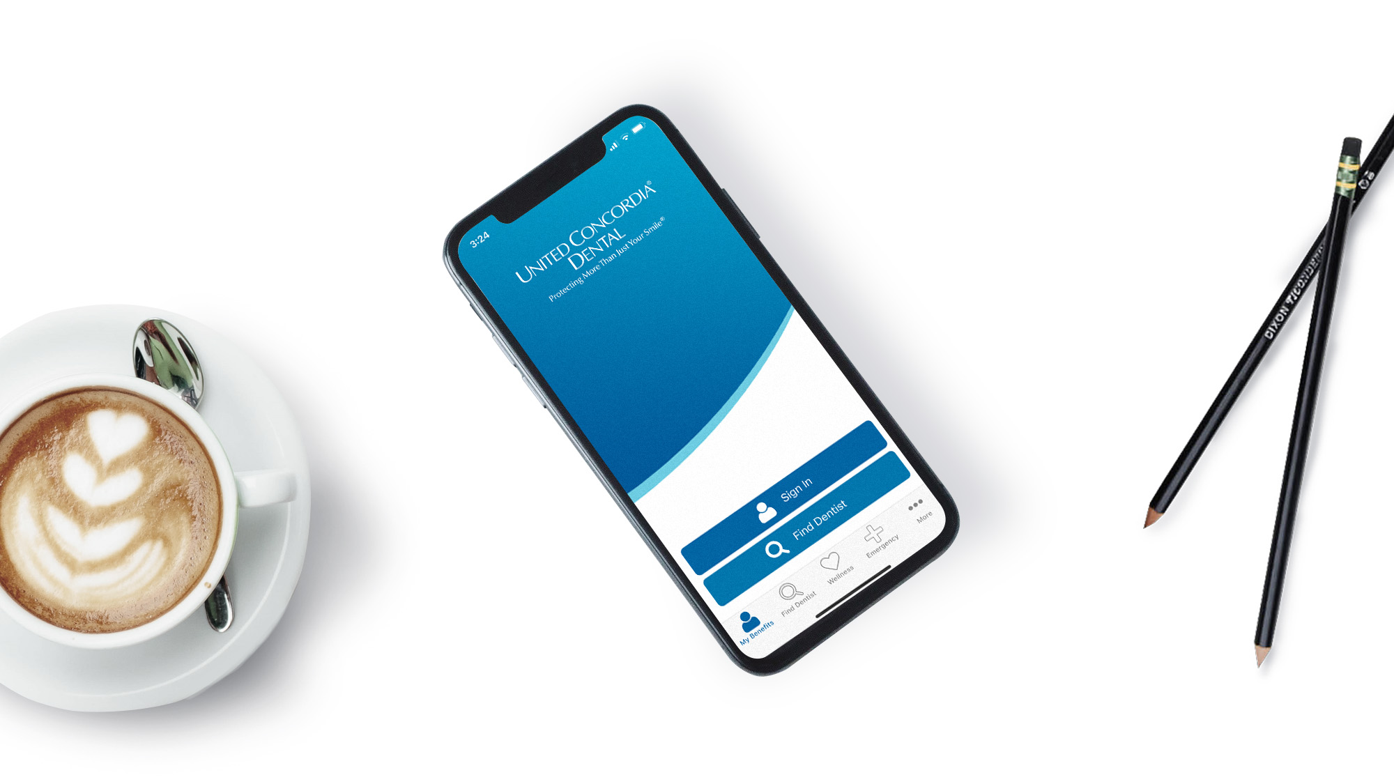
Increasing access and self-service for members
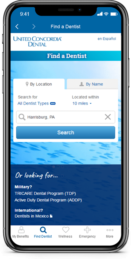
2018 was a significant year for the mobile space. In the second quarter, we launched a newly updated mobile app and in the third quarter a revamped find-a-dentist tool. My role was the sole designer behind the mobile app redesign.
Finding the right approach
Our team’s approach was agile and iterative. I stayed 1-2 weeks ahead of the development team and worked closely with the client to validate business rules and acceptance. I began with creating concepts and wireframes and finished with an interactive prototype to use for user testing.
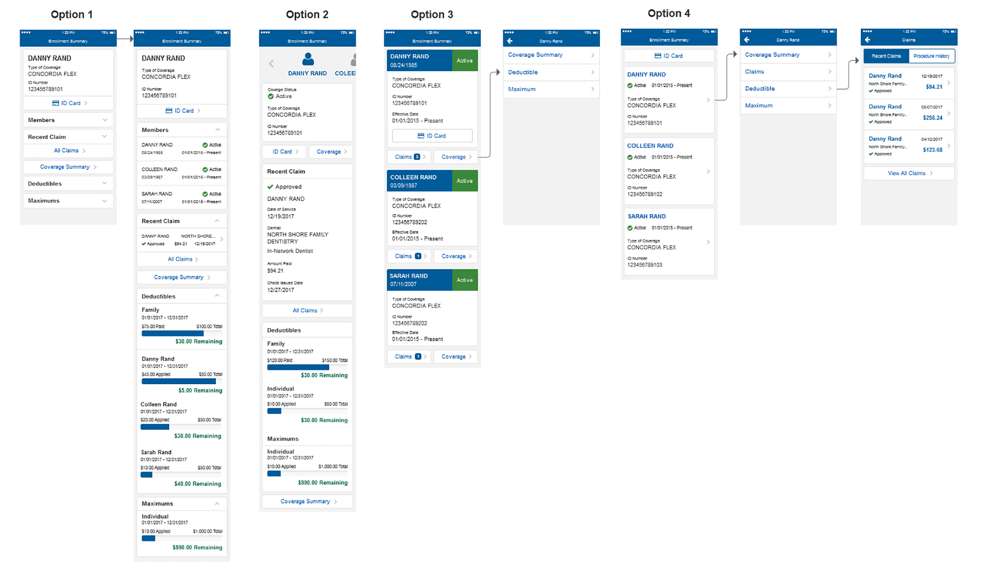
I conducted a competitive analysis and market research to decide the best direction and moved forward with flows to prepare for user testing.
User Testing
In order to reach our goals, I conducted user testing to…
- Validate that users could find and understand their benefits
- Confirm that all members could log in and use their ID card
- Simplify dental terminology and increase user understanding

Final Design and Accessibility
The final design consisted of an interactive Axure prototype, wire-flows, assets, and a complete build-out of the entire application with annotations.
We maintained accessibility by following internal manual and external iOS/Android standards.
3 Key Takeaways
- The app is currently the highest rated dental insurance mobile app on iOS
- Mobile app launched without any major hang-ups
- Usage rates have increased by 20% since launch
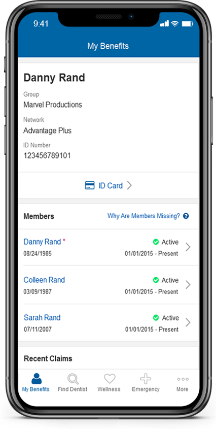
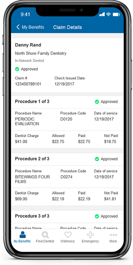
In conclusion, I found the relationship between iOS and Android to still be majorly disconnected. Designers are forced to break rules and favor platforms in order to maintain consistency.
Want to learn more about my proprietary AI design process?
Let's have a conversation.
