Health Benefits Ecosystem
Improving the overall dental benefits from an internal and external perspective.
The road to a new benefits experience
In 2014, an affiliated national insurer announced an ambitious goal to redesign and change its benefits system. They aimed to make benefits more accessible and transparent to providers and members. This work spanned from 2014 to 2022.
Make benefits more accessible and transparent with providers and members.
1
Design Strategy >
2
Benefits Platform >
3
Provider Portal >
4
Member Portal >
The road to new benefits has taken several years, and work continues today. So far, I have worked alongside a UX team, several project teams, and several client stakeholders. It included creating a design strategy, designing a benefits-coding system, and redesigning a provider portal.
Project 1
Benefits Design Strategy
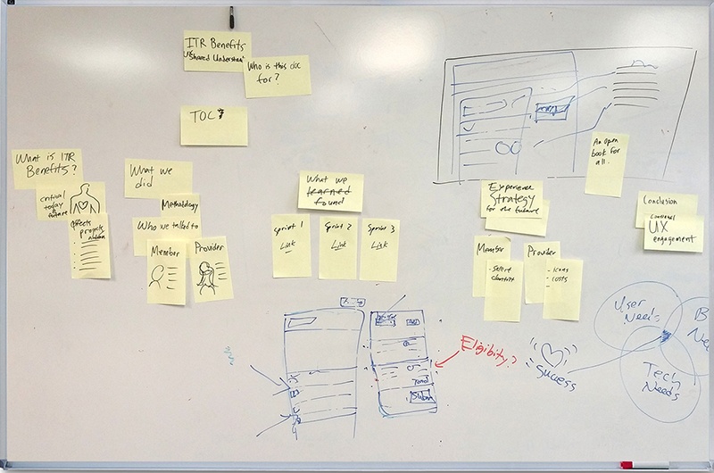
UX led a research-based approach that lasted more than three months in 2014. We focused on delivering a shared understanding to inform future business and design decisions using a user-centered design process.
What were the challenges?
In 2015, the benefits system was nearing the end of its life span in the market, initially created in the 1990s. New products were released to keep up with healthcare reform, and the system struggled to keep up. The business sought to modernize its capabilities and keep up in a competitive market. Consumer behavior continues to evolve; therefore, the insurance market must anticipate future needs.
Our vision for the benefits research initiative was to ensure the client had a design strategy that ran parallel with their business. We called it the runway.
What was my role?
I focused on understanding the breakdown of benefits text, completed an analysis of required features for user testing, and conceptualized displays for member screens. I worked alongside a front-end developer who built HTML prototypes based on my designs. After testing, I co-led the creation of the final test findings and communicated them to the client.
Goals:
- Unite the business with a shared understanding of its users and benefits
- Create a runway to inform business and design decisions in the future
- Dive deeply into the present-day benefits experience and synthesize findings to create usable insights
MEMBERS
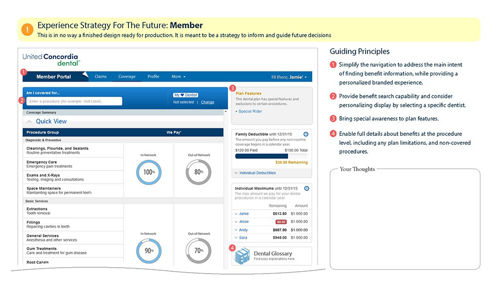
We knew that members struggled with industry-specific jargon. So our first steps were to compare the old language with a new simplified translation. What we did was very tedious but worthwhile. First, I pulled data from the old benefits system, worked with a subject-matter expert, and translated the verbiage. Next, we simplified the text from high-level reading to about 6th and 7th-grade reading levels. I did this by rearranging text to have procedure names listed first and glossary-like explanations that described benefits in layman’s terms and shorter sentences.
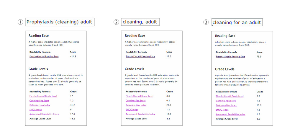
When we tested and compared verbiage in the first round of testing, we quickly validated that members were looking for simplified and translated text.
Test A – Technical Text Feedback
User task completion scores for technical language were 70%
“The site did not use words that the everyday person could understand.”
Test B – Simplified Text Feedback
User task completion scores for simplified language were 95%
“I think it was user-friendly and straightforward to understand.”
Task completion scores for technical language finished at around 70%, while scores for simplified text finished at about 95%.
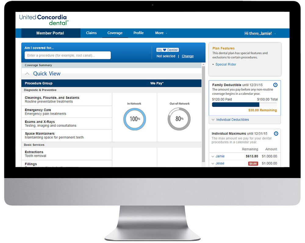
We also explored new patterns for visualizing data, numbers, and percentages. For example, dollar amounts and totals would be displayed separately instead of being surrounded by unnecessary text.
“When I come to this kind of website, I am already a little bit stressed because numbers and technical things confuse me.”

In the first round of testing, we created a visual panel that displayed family deductible information.
We tried:
- Using color to distinguish differences, but found that it only increased complexity.
- Displaying all family members in the panel increased the time it took to comprehend all the data.
- Mixing visual lexicon with data but it was confusing for users because they had to interpret what the icons meant instead of just reading the numbers.
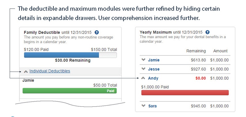
In the second round, we reduced the deductible panel to one color, pushed individual members to a hidden expandable panel, and removed the visual lexicon. Again, it significantly increased user comprehension and reduced the time required to complete specific tasks.
As we continued testing, we did the business analysis on how we group and categorize benefits. We found that benefits were grouped differently throughout the customer experience. Sales and marketing displayed benefits differently than the portals. We overlooked end-users, and the benefits weren’t easy to understand from beginning to end. As a result, the organization missed opportunities to create consistent experiences.
PROVIDERS
Providers were looking for benefits that displayed what is and is not covered.
“You never want to go in guessing what the codes are and if you have a list of the things that are covered, it is helpful to have a list of what isn’t covered.”
We introduced a search filter feature. There were differences in keywords used that referenced the same thing. Like how people refer to pancakes, they can be called pancakes, of course, but also flapjacks, hotcakes, or even crepes. We felt a filter would be helpful because it removed anything the user didn’t want to see. However, it would need to be an intelligent search to incorporate keywords.
A quick look to the future – through conversations with customer service stakeholders, we created a repository of consumer-friendly keywords. They had plans to implement a new tool to record conversations and convert them from speech to text. We could pull out the data and find ways to collect commonly used or unique words. Customer service is pushing forward with the solution, but the update will need to happen in the future.
What was the outcome?
We shared our findings with key stakeholders within our client’s organization. Unfortunately, as a result, the impact of our research has not been fully realized. Still, it has been shared in project kick-offs and referenced by multiple stakeholders during project meetings and collaborative sessions.
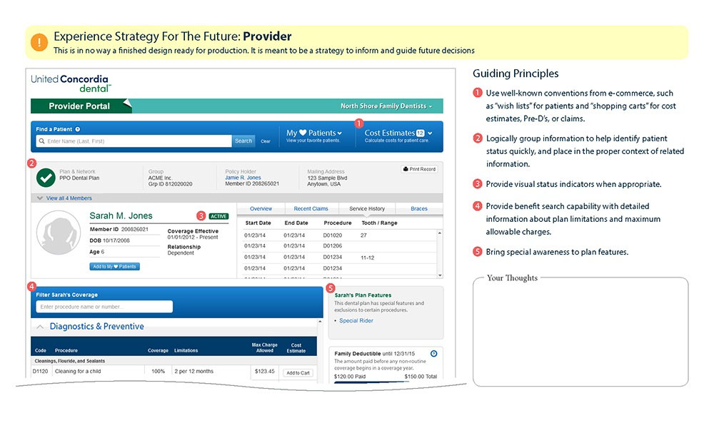
As we improved the member experience, we found that the provider audience appreciated the same changes. We initially thought that providers would be power users and have different needs. When in fact, it was the complete opposite. Office administrators usually have no formal training and typically question the doctor to learn.
Project 2
A Simplified Platform for Benefit Coders
Our client wanted to move from green screens to a modern dashboard to display new benefits in 2016. As a result, the data transformed from long paragraphs of text to individual chunks of meaningful data.
What were the challenges?
Redesigning benefits data to be accessible was a significant architecture and design problem. The architecture team spent over a year working with benefit coders to understand the system and develop a better solution. After the initial year, I was added to the project as the sole UX designer to design a new interface for the benefit coders.
To help the client understand our benefits process, we used a restaurant analogy. The consuming applications coming later would represent the dining area. For this project, we focused on the kitchen. In the kitchen, we have the ingredients which represent the individual pieces of benefits data. The coders must mix them, using the correct amounts, to produce something people can eat. We worked with the coders to create a recipe to deliver a consistent product.
What was my role?
I led design efforts pulling in other UX team members for critique and feedback. My role included facilitating collaborative meetings and helping communicate directly with customers. Since the project was completely new, I led a project team to gather requirements from the customers. My team had to align with a newly implemented Agile process during the design process.
Goals:
- Create a scalable drag and drop dashboard for the coders to build and manage complete benefit plans from detailed level benefit data (the recipe)
- Make a template-based interface for coders to use as a foundation for future insurance plans
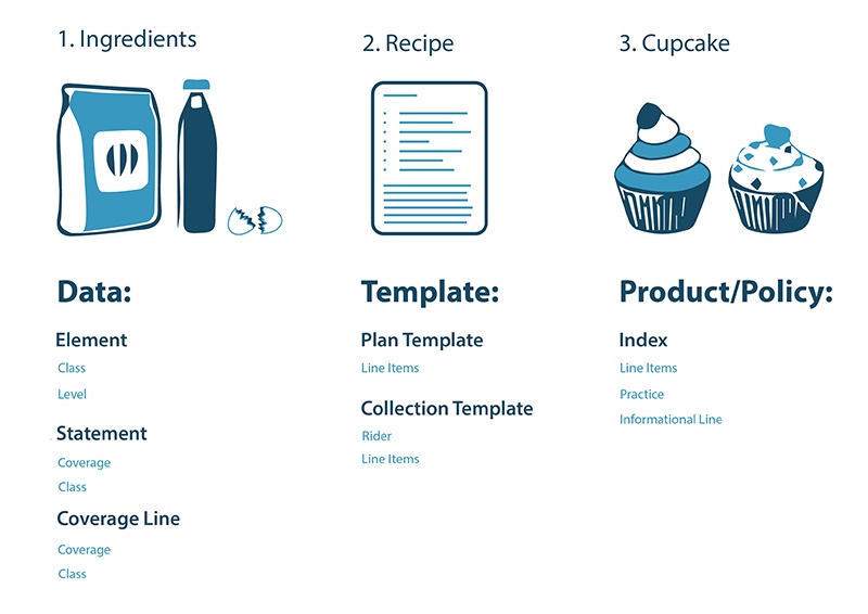
How did we do it?
Due to the technical complexity behind the system, our team held several meetings every week to collaborate, question, and build the data structure. We started at the data level and worked our way up to build out complete plans. I worked in parallel to design the UI and held separate meetings with the customer to elicit business requirements. Through continuous conversations and managing a diverse team, I built a strong rapport with the customer and began implementing the dashboard.
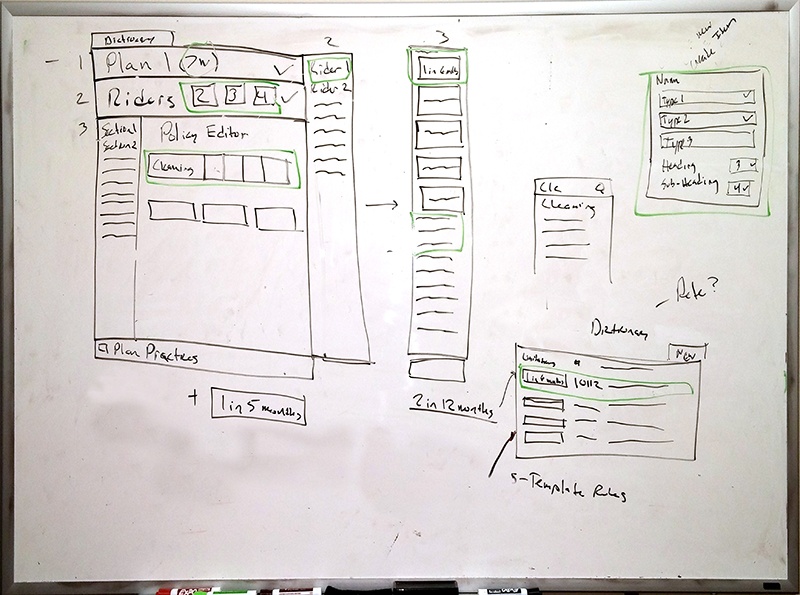
I chose to approach this project Lean because the project involved more UI design than experience thinking, and the customer and user were the same people. By sketching core concepts and projecting them on the whiteboard, I invited the team and customers to critique and draw on the whiteboard. Once everyone was comfortable enough to sketch in front of the group, we found a flow, and things progressed quickly. I was able to take a sketch and receive buy-in within the same day.
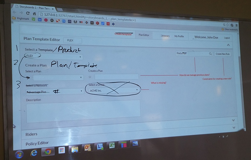
The customer requested to use a drag and drop interface. The concept was simple. Starting with the data layer, the user would drag and drop to create statements. Then they would combine those statements and continue until the final layer. The problem was not the drag and drop feature but the barriers between layers. It was hard to reference and compare data as you moved up layers. We had to introduce search capabilities and clear validation to help users find what they were looking for and know if they were making a mistake.
Our best feedback came when I could user test with our customers. I put together a test plan and set up user testing sessions. As they used the prototype and walked through tasks, I collected feedback and pivoted on design decisions. For example, I found that the navigation was too structured and needed to be loose enough for scalability in the future.
The customer decided to scale multiple layers deep with a single tree navigation instead of using the page for a secondary navigation. Something I recommended they do, considering the complexity of the system. A year after the project, the customer made an enhancement request because of performance issues with the navigation tree.
What was the final output?
A year after implementation, the benefit coders have implemented nearly all of the plans in the old benefits system. In addition, we made tweaks and enhancements to increase performance. As a result, we have significantly simplified their process and reduced the time it takes to code and train new employees to use the system.
Project 3
Provider Portal
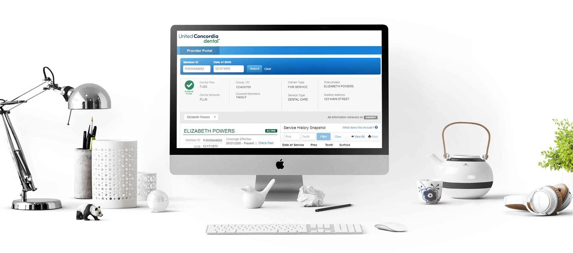
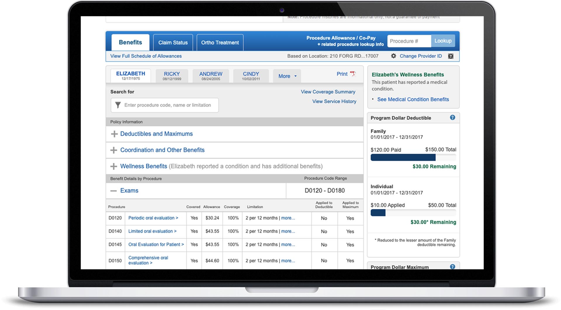
The provider portal is the most used application and arguably the most important for United Concordia. Providers face complicated medical benefits. We need to feed them accurate on-demand information so they can educate and care for patients. This work was completed in 2019.
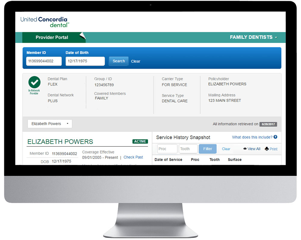
What were the challenges?
Convincing stakeholders to allow us to complete in-person user testing on a tight schedule was not easy. Nevertheless, it proved invaluable, though stakeholders still bring it up in meetings.
Designing a view that presented Providers with everything they needed in one view was not easy. Everything we built had to work with the current portal design, and making it easy to search or the filter was vital to the project’s success.
What was my role?
I led the prototyping and design efforts and, with a co-worker, completed in-person user testing with Providers at their offices. I used secondary research to make informed design decisions in building out the benefits view in the Provider portal, and we used that to create a test script. We traveled to dentist offices and completed user testing using the usertesting.com platform using moderated testing.
Goals:
- Create a portal that is easy to use and become the industry standard
- Increase self-service and reduce customer service phone calls for benefits
- Increase adoption rates
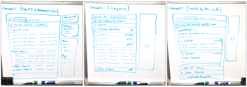
Since the benefits experience strategy research was complete, we applied it immediately in this project. Based on customer requests, we added new features.
After convincing stakeholders to buy in and participate, we conducted user testing. While listening to customer service calls, we found that most providers ask the same questions. In addition, most providers have a checklist of questions they ask. So we built our user test plan based on those questions.
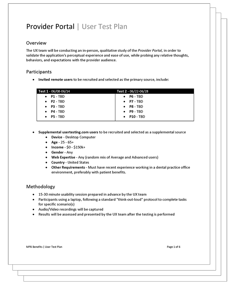
Our goal was to test with ten providers, actually reaching 9. We hypothesized that if providers could easily complete the tasks, we could increase self-service adoption rates and reduce the number of customer service calls. However, from Opinion Lab feedback, we knew that providers lacked trust in the old system for two reasons.
- Users were unable to read and make sense of their benefits
- Data was conflicting or missing
During the Benefits Experience Strategy Research, we designed various ways to show benefit data. Providers know what they’re looking for and refer to service ranges to find procedures. All we needed to do was lay out the services in a clear-ranged format. My original accordion design tested well and fit the mold.
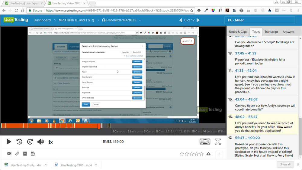
We spent a lot of time during the benefits experience strategy research designing different ways to show benefit data. Because of that testing, we already knew how we wanted to display and group the data. Providers understand what they’re looking for and refer to service ranges to find procedures. All we needed to do was lay out the services in a clear-ranged format. My original accordion design tested well and fit the mold.
We wanted to display unique plan details and member-specific data in the new benefits. In addition, we made informed decisions to educate providers about additional plan features for their patients. Providers are educating members, and that is where conversations are happening. We wanted to tell the provider as much as possible about the member’s benefits.
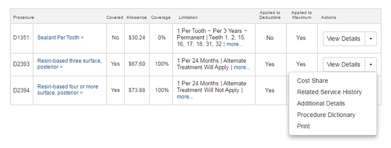
We didn’t want to leave some providers behind while others kept up with technology. So we redesigned the print functionality. As a result, any doctor’s office can access their information regardless of technical capability.
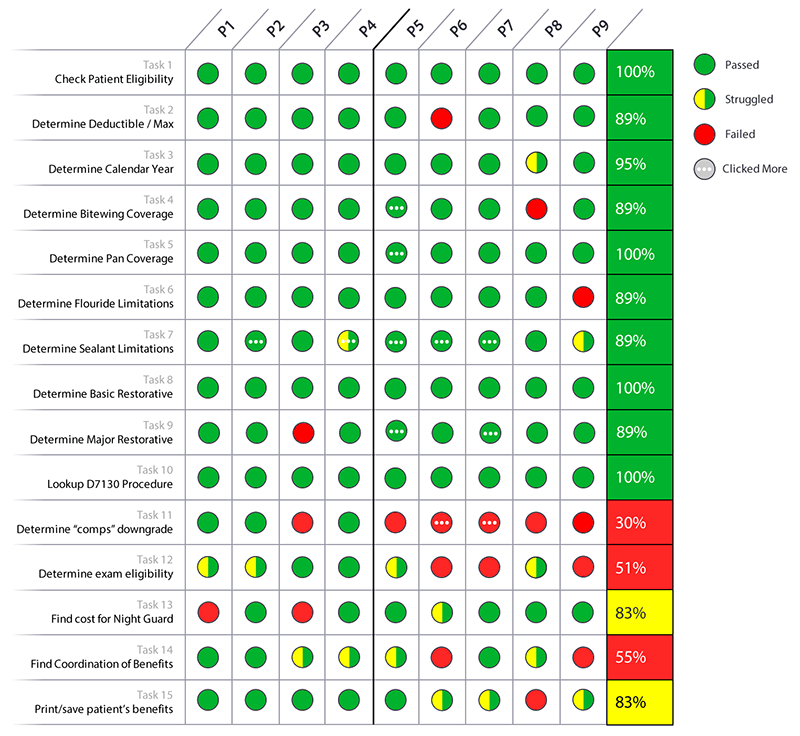
Overall, task completion was high. Three outcomes required improvement:
1. Users could not decide because data was not shown consistently for both true and false scenarios. This would lead to customer service phone calls.
Solution: We decided to show outcomes for both true and false cases.
2. Users looked for unexpected keywords that were unavailable in the benefits.
Solution: We added the keywords and synonyms.
3. Users struggled to determine eligibility because of unnecessary calculations.
Solution: We changed the layout and moved relevant data closer. We encouraged the business to consider enhancements by doing the math for Providers.
What was the final output?
Our team launched the redesigned portal in December of 2017. After the first month, we successfully increased usage rates by 47%. We also received anonymous feedback from several Providers that stated we had the best portal of all competitors.
Project 4
Member Portal
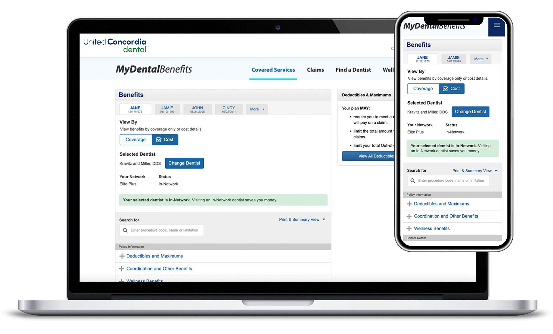
In my role as Lead Designer, I spearheaded the redesign of an insurance member portal, introducing industry-first features that significantly enhanced user experience and transparency in healthcare costs.
Key Achievements:
Coverage Percentages for Benefits: We implemented a new feature that clearly displays coverage percentages for all member benefits, offering users immediate insight into how much their insurance covers across different services. This transparent design improved user understanding of their healthcare plans, leading to fewer customer service inquiries.
Cost Estimator: I led the development of a groundbreaking cost estimator, a first in the industry. Unlike competitor tools that offer general estimates per service or procedure, we created a system that provides users with exact costs specific to their chosen provider and location. This feature eliminates guesswork and enables members to make informed decisions about their healthcare options.
These innovations not only simplified complex information but also set a new standard for the insurance industry, offering members a level of clarity and accuracy that had not previously existed.
Want to learn more about my proprietary AI design process?
Let's have a conversation.
